The humble apostrophe.
Fairly insignificant, but so often misused, abused or altogether forgotten.
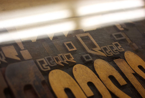
Initially, with the advent of word processing and desktop publishing, the apostrophe was substituted by [′] — the minute, feet or prime glyph. Typographically speaking, wholly incorrect. Serif fonts are works of art and the font designer took many painstaking hours to create this thing of beauty. Punctuation marks are as much a part of the English language as the consonants and vowels themselves.
Secondly, the misuse, or omission, of an apostrophe can create a whole different meaning to a sentence. Let us look at two sentences and analyse the difference an apostrophe can make.
“You really know your shit” and “You really know you’re shit”
The first sentence implies that you have a wealth of knowledge and are very good at what you do, but the second confirms that you know Jack!
But I’m writing about the shape of the apostrophe itself — so many times I have seen the ‘prime’ substitution of an apostrophe and it drives me nuts! Whether it’s a Serif or Sans Serif font, there is usually a corresponding correct apostrophe glyph, but it seems to get forgotten or overlooked by the creator of the text containing it.
It makes me laugh that even Industry Standard page layout programs have a preference setting for “Use correct Printers Marks” when it comes to using quotes and apostrophes — WHY? There should not be alternatives for apostrophes and quote marks.